News, Views & How-To's

Color Management

To the sign, design, graphics and art communities, color is everything. It separates good designers from bad and informs most of our design decisions. That's why it's imperative to get your colors right, whether you want to create the best output for your inkjet printer or you need to choose the best color for a CTA button in your web design. The following articles about color management represent some technical software posts as well as some fun infographics and informed opinions about the wonderful world of color.

Color Your World Infographic

In the month of July, Roland DGA is celebrating color! Enjoy this infographic that takes a psychological look at some popular color theories. Whether you're a print expert, graphic designer, artist, or simply a color-lover, this fun graphic is perfect as a quick color reference for use on your designs, artwork, branding, web colors or call-to-actions. For more useful info, don't forget to register for our color fundamentals webinar series.

더 보기
Info Central for Roland Tips and Tricks

In the second of our info blog hubs, we’ve made an extensive list of all the useful tips and tricks for Roland DG software, inkjet printers, flatbeds, dye-sublimation printers, CNC machines, dental milling machines and more. Also included in this rundown are some small business advice articles and other resources to help you grow your company.

더 보기

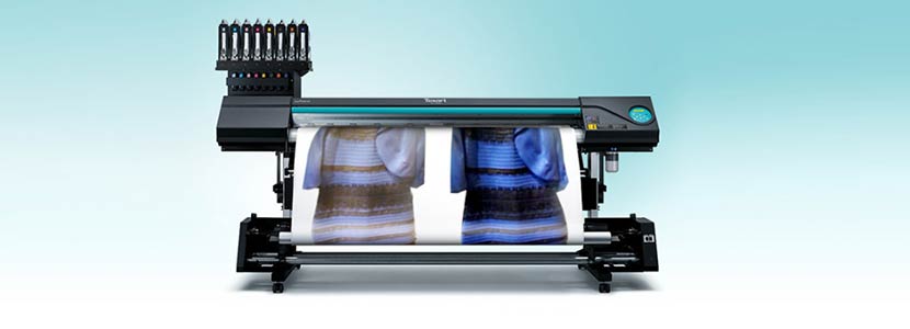
What Print Color is This Dress?

What color is this dress? We don’t see blue and black, or white and gold, we only see color management, color perception and output control that can be put into practice. To the uninitiated out there, the following blog post explores the issue of converting color we see onscreen to something which exists in the physical world as printed graphics, and how those colors will be output and perceived.

더 보기

Creating a Color Management Preset Comparison File

Roland VersaWorks offers a variety of helpful color matching settings, such as Prepress US, Max Impact and Sign & Display. These specialized settings allow users to quickly select the option that is most suited to the application at hand. The software also allows you to see a side-by-side comparison, which provides a visual benchmark for determining which setting to choose for the specific assignment.

더 보기

Synchronize Your Color Workspace

We all know that there are many output factors that can affect color (heat, resolution, ink limit, profile, spot colors, etc.) There are also factors on the input side (occurring before you even bring a file into queue) that will influence the way the colors in a file will print. Creating a synchronized color works pace within your design software will give you the best chance of having predictable color across different design platforms and file types.

더 보기

How to Obtain the Perfect Gray

One challenge many users are facing regularly is how to print neutral gray images. We have to admit, gray is one of toughest colors to achieve because it uses all four colors on the printer, and they have to be perfectly balanced. Any small variances in the ink amount can shift the color. Here are a few tips to help you achieve that perfect gray color.

더 보기